The right background color or image can directly impact user engagement and readability. A carefully chosen background can highlight content, improve accessibility, and boost your page's overall effectiveness.
When working with components you'll find that many have a Background settings tab. This tab will allow us to change the background color, set a background image, change the text color or set a translucent background:
Options Available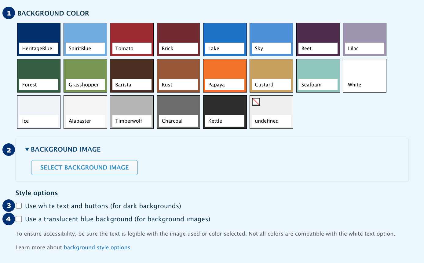
- Background Color. Allows you to choose a background color from our color palette.
- Background Image. Allows you add an image as a background. View our image sizes article for dimensions.
- White Text and Buttons. Makes content accessible in dark backgrounds.
- Translucent Blue Background. Helps make content legible when using background images.
Basic Guidelines
Contrast
When working with a dark colored background use the White Text option to change the color of the text and buttons. Light colored backgrounds don't need this.
Visit our palette for guidance on the recommended text color for each color in the palette.
Legibility with Busy Backgrounds
If an image background is busy or textured, consider using the Blue Transparency to enhance legibility.
Nonetheless, not all images will be a good fit for backgrounds. Careful consideration must go into the selection of background images and most images will require cropping or enhancements.
Consider Mobile
Verify that the text remains legible on mobile devices and that the image is to your liking. Additional adjustments may be needed to achieve a design that works well across all devices.
Balance your Page
Overuse of background colors and images can distract your readers from the main focus of your page.
Examples
Headers
Using colored or image backgrounds can make a webpage stand out, but they should be chosen carefully. While they add visual appeal, it's best to reserve them for special pages to highlight their significance. On regular pages, keeping backgrounds simple helps keep the focus on the content as the priority.
 Designed thematic image

Texture image that relies on colors from palette

Color can help set the tone of the page

Plain background can help keep readers focused on the content
Example Components

50-50 Contained with a solid mustard background.
Using only a color allows users to focus on the image

50-50 Full Width component with a photo image background

If you have repeating content consider using
zebra stripes to break the content into groups

A single column component can be a great way to end a page
What NOT to Do
Below are a few examples of things you definitely want to avoid. These have been exaggerated for example purposes but these may present in more subtle forms so a critical eye is important.
Low Contrast
Whether it is on dark or light backgrounds, make sure your copy, headings and buttons are easy to read. When in doubt, visit our palette for guidance on the recommended text color for each color in the palette.


Overly Busy Backgrounds
Just because an image is a perfect fit for your topic, it doesn't mean it's a good fit for a background. As you can see in the sample below, even though the image is mostly dark, it is so busy that it makes it impossible to read the text on it. Images like this may not be readable even with a translucent background.
